- #LivinginKitsapCounty
#PremierAgent
(reposted)

For a Reno With Staying Power, Rethink These Tempting Trends Avoid them now, thank us later.
Trends are tantalizing. But by definition, they end. There’s a palpable tipping point with just about every trend when it goes from of-the-moment to overexposed (and then often on to obscurity). When it comes to a set of past-their-prime leather chairs, it’s no big deal—donate them and move on. But ditching a dated design feature or hauling out a home fixture, well, that’s not so easy, practical, or affordable. Before you buy that Pinterest-perfect ’70s wood paneling or embark on a floor plan that looked foolproof on a tiny Instagram square, listen to some expert advice. We tapped interior designer Michelle Beamer of MB Interiors, who has renovated homes from Santa Barbara, California, to Washington, D.C., for some advice. Having seen certain fads grow tired across the country, here is her list of trends (aka potential regrets) to steer clear of.
Waterfall Countertops
“These are too heavy-looking for most kitchens and too expensive for most clients. They can also be a little gaudy, as in ‘check out all the marble I bought!’ Plus, it’s not like you can make a piecrust on that waterfall.”
Massive Exhaust Hoods
“Suddenly hoods have become these huge, super-shiny, and even studded masses of stainless steel. Enormous exhaust hoods (or any functional, utilitarian appliance) shouldn’t take center stage in a kitchen. Instead, make hoods disappear and keep them minimal by using an exhaust liner.”
All-White Cabinets
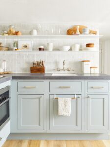
“I always urge people to try a darker, lower cabinet if they insist on white uppers, to give contrast and variety. In general, open shelves have replaced upper cabinets. They have clean lines, make it easy to see where everything is, and are great for displaying pitchers, cookware, heirloom pieces—anything that complements your decor. Open shelves are the new china cabinet.”
Formal Dining Rooms
“If a dining room is not conducive to your everyday life, don’t build one. Instead, create a breakfast nook or an oversized island where everyone can be together.”
Shiplap
“Clients get so excited by pictures of this tongue and groove, but there are tons of other treatments. There are all kinds of wall paneling designs, from Regency to Greek Key, that will add texture and polish. Any shape can be made of wood; talk to your carpenter and chances are you’ll find something you like even better.”
Flat Paint
“I’m continuing to see people opt for white over wild uses of color, but if you’re going to paint your walls white, add some texture with a smooth plaster treatment, or use grasscloth or a wallpaper, such as Barkskin. You’ll get much more movement and not just a flat wall.”
Blown-Out Spaces
“It’s great to open up a floor plan, but don’t lose all your transitions. Pay attention to how one area connects to another, what the ceiling is like, and what kind of architecture and charm already exists. Rather than blowing things out without any sense of division, make a threshold, doorway, arch, or cove to help delineate the spaces.”
Shower Curbs
“Curbs are bulky and easy to trip on. Instead, create a zero-entry walk-in. It’s more expensive but much more beautiful, safer, and sleeker. Choose tile and let it move from the bathroom floor into the shower and then straight up the shower wall for a super-clean look that enlarges the room. Curbless showers require a precise slope, so plan in advance.”
https://www.domino.com/content/dated-renovation-trends/

